Difference between revisions of "Zynthian UI User Guide - V5"
| Line 31: | Line 31: | ||
* '''Long-push:''' More than 2 seconds (until the long-action is triggered!) | * '''Long-push:''' More than 2 seconds (until the long-action is triggered!) | ||
| − | Please, note that not all buttons have assigned | + | Please, note that not all buttons have assigned all of them. |
[[File:keypad_buttons_detail_01.jpg|400px|right]] | [[File:keypad_buttons_detail_01.jpg|400px|right]] | ||
Revision as of 13:07, 26 July 2023
1 General Concepts
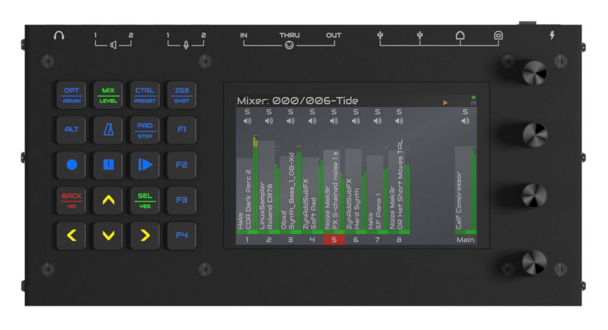
The zynthian V5 physical user interface is composed, from left to right, of:
- 5x4 push button grid with RGB-LED feedback
- 5 inch display with capacitive touch
- 4 infinite knobs (rotary encoders) with switches
this richer interface allows to simplify navigation and reduce the number of "clicks", what improves workflow and makes it faster and more intuitive.
The 20 silicone push buttons and the 4 knobs with switches are the primary control mechanism to navigate the UI:
- accessing the different screens
- selecting options on menus and lists
- adjusting parameters
Most operations may be performed with the touchscreen but some may not be intuitive or easy to perform with it. In the other hand, some operations are specially optimized for using the touch screen. This will be detailed when explaining the different screens and workflows.
Of course, the key difference with the "classic" zynthian UI is the big silicone button grid, what adds 20 push buttons with RGB LED feedback, allowing huge improvements in the workflow. Let's take a closer look to this.
1.1 Using the silicone push buttons
Some buttons have several functions assigned while some have contextual functions that depends of the current screen. All of them shine on different colors depending of context.
Like classic UI, there are 3 types of push actions that can be performed, depending on how long you hold down the button (or knob):
- Short-push: Less than 0.3 seconds
- Bold-push: Between 0.3 and 2 seconds
- Long-push: More than 2 seconds (until the long-action is triggered!)
Please, note that not all buttons have assigned all of them.
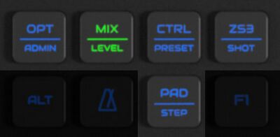
Buttons having 2 different functions assigned to them have a line printed in the middle. The primary function is printed at the top and the secondary function is printed at the bottom. Each button's led color depends of current selection:
- when the primary function is selected, the button shines on green.
- when the secondary function is selected, the button shines on orange.
- when none of the button's functions is selected, the button shines on blue.
A short-push on the button will:
- select primary function, when none of the button's functions is selected
- select secondary function, when button's primary function is selected
A bold-push on the button will always access the secondary function, not matter what is currently selected.
Some buttons have a tertiary function assigned to long-push:
- OPT/ADMIN => Long-push to power off!
- CTRL/PRESET => Preset favorites
- PAD/STEP => Arranger screen
Note:
Although all buttons and switches are fully configurable from the webconf tool (hardware->wiring->advanced), this guide refers to the official V5 profile configuration, that matches button printings. Of course, you are very welcome to experiment with button assignment and try different configurations. In fact, if you reach a sweet point, we could manage to produce an alternate keypad with custom printings.

